

I have posted a warning vis-a vis using a reformulated Rublev Wax Paste.
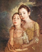
I have been very fortunate to have been able to buy and experiment with some very pricey paints over the years- and for the painting I am currently working on these are the ones I am using. I would love to post more works in progress and some finished stuff- but this is a new computer and I haven't gotten around to a download app and this came from my husbands Apple. You can see that there is very little rhyme or reason in my method.. I make a skin-tone paint blob and keep mixing until it matches her skin- literally. I walk up with the color on my palette knife and holding it close to the area being painted ( without stabbing her) squint- and if I have a match I go for it. Placing closely related values next to each other and looking at the model I go bluer, redder, more yellow whatever. I blend very little and use different colors for each area. In other words it is not making an orange skin-tone simply lighter or darker but bluer, redder pinker etc. The tones are placed side, by side without mixing. After a while you develop a rhythm.
Yesterday I too a quick trip to the Rhode Island School of Design Museum- the have Celia Beaus, Manets, Sullys and Stuarts it is a gem. I noticed that the liveliest portraits and figures have a glow about them a translucency. It is not from blending colors from light to dark in flesh-tones but deft sparkling touches of blues, greens and pinks etc. left almost unblended.
Left to right:
1; Micheal Harding Cremnitz White Lead in Walnut Oil. Very creamy and the whitest lead white I have found. Wear gloves or use a skin barrier.
2: Natural Pigments wax medium. I mix about 10% not more, into the paint- keeps the color from sinking in and you don't need to varnish
3: Micheal Harding Genuine Naples Light
4: Maimeri Puro 083 Cadmium Yellow Medium
5: Micheal Harding Yellow Ochre
6: Micheal Harding Indian Red
7: Micheal Harding Cadmium orange. ( the current painting is predominately blue and brilliant orange)
8: Vasari Cadmium Red light
9: Vasari Ruby Red ( absolutely the cleanest, brightest blue red- makes fabulous pinks and richest magentas)
10: Maimeri Puro 174 Crimson Lake - the best Alizarin substitute I have found- lovely.
11: RGH Artists' Oil Paints Quinacridone Violet Deep. A deep red that is invaluable to reducing the value of reds without dulling or greying them. A real find.
12: Micheal Harding Cobalt Blue for this painting specifically as it has a strong cobalt blue background and I use it to mix into the skin-tones
13: Not on the palette- Micheal Harding's Ultramarine
12 Vasari's Mars black I am using Mars black as I have large black areas and Ivory black is too transparent and sloooow drying.Ivory black is better using in mixing-Mars black is more durable and opaque- best is large areas.
14 : Not on palette- Micheal Harding's Ivory Black- I tried some other blacks and this seems to be the darkest. I have the Old Holland Scheveningen Black- supposed to be the darkest. I did a side by side with the Harding and I think the Harding is richer.
There are other colors I use depending on the painting I am working on. As you see I do not use a lot of earth tones. When I am reaching for brilliant chroma I will use the best pigment I can find- if you are reaching for a brilliant purple- in my opinion it is best to get a tube of a purple paint.
15: Not on palette: Micheal Harding's Viridian
16: Micheal Hardings's Raw Umber
17: Micheal Harding's or Vasari's Cobalt Violet Dark- Vasari's is a bit pinker.
19: Micheal Harding's Ultramarine Violet.
Old Holland is a fine paint company- highly pigmented but I have never taken to their heavier consistency.
I make quickie color panels on those cheap small appx 8x10 " canvas panels. I made a run of full strength to light of similar colors- ie Maimeri 174, Blockx Carmine, Vasari Ruby Violet etc. to assess the best Alizarin substitute etc.
Actually I am adding some brilliant touches of Viridian to my painting after making another study of Matisse and I don't know who said this and I am paraphrasing- 'for all you need to know about color study Matisse".
 |
| "The Conversation" Henri Matisse |
I think the Micheal Hardings' give you the best value for the money in the high end paints. You can buy them in 225 ml tubes. The Vasari reds are incomparable and they have a sale on them in September. I tried every pink on the planet and the Vasari Ruby Red is the cleanest and brightest and is able to reach those high chroma pinks. Nothing else came close.
The Vasari and the Micheal Harding cobalts were on a par- the Harding comes in a 225 ml tube @ $170 (ouch)- the Vasari large tubes are only 175 ml.
A fellow named Gunzorro ( Jim Harris) on WetCanvas did the best paint comparison side by sides on the web- Google Wet Canvas and Gunzorro and you will find charts like these for just about every oil paint manufacturer. He also does great paint manufacturer reviews- but you will have to ferret them out for yourself. I asked him if I could post his results and he said yes. I wanted him to make an album but he won't- drat!
http://www.wetcanvas.com/forums/archive/index.php/t-608748.html
http://i25.photobucket.com/albums/c80/gunzorro/IMG_8652web.jpg
My favorite art supply store is hands down- http://www.italianartstore.com/store/index.html
It is a shop for pros with great prices. Claude will go out of his way to get you something you are desperate for even if it is not in stock. A pro painters' pro with a sexy accent.
https://vasaricolors.com/products for Vasari paint.
http://www.naturalpigments.com/wax-medium-2259.html wax medium.
http://www.rghartistoilpaints.com/index.html
RGH is a really fast shipper- I get them quickly because we are both on the East coast. His Cremnitz whites are worth a try- in safflower and walnut and they are cheaper. I have used them. His paints are very high quality and some sizes come in jars.
There is a lot of controversy over lead white and for good reason. Lead poisoning- which I got. It was my own fault- I sanded, scraped and pushed it around with my bare hands- I breathed in a lot of dust. I am much more careful now- I wear gloves or use a barrier cream. However- it is the winner in longevity because of its greater flexibility- it is also more transparent, making possible more subtle transitions in skin-tones.


2 comments:
I really appreciate it when a professional artist takes the time to share information like this. Thank you so much.
Your nude takes my breath away, Exquisite indeed.
Thanks!
You are no slouch yourself and have a gift for color.
Have you seen Euan Uglows florals?
I am going to do a post on Jane Peterson- great Boston Impressionist- her florals are fabulous- I saw them in the flesh, as it were, in Boston..
That Vasari Ruby Red is worth every cent. I was doing a workshop in Scottsdale and someone gave me a sample. I had not been able to get the pinks I want til I tried that.
The cad red light is the clearest and brightest cad I have found. They have their red sale in Sept.
You don't need much.
Loved your "Artist Models".
Post a Comment