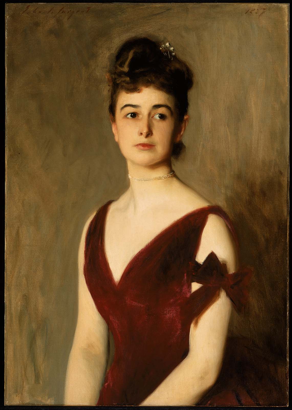
This is not a blog piece on criminals in paint or maybe it is. It seems that Van Gogh was among other things addicted to certain colors (mainly blue reds) that have faded over the years. There were at that time colors that were more permanent, but like most color addicted painters, you use what gets you from here to there. One note off can ruin a whole symphony. He used particular colors and they have faded.
http://www.nytimes.com/2015/05/22/arts/design/review-van-gogh-irises-and-roses-sheds-light-on-a-disappearing-red-hue.html?mabReward=CTM&moduleDetail=recommendations-2&action=click&contentCollection=Arts®ion=Footer&module=WhatsNext&version=WhatsNext&contentID=WhatsNext&configSection=article&isLoggedIn=true&src=recg&pgtype=article
 |
| J S Sargent Mrs Charles Inches |
Here is another article from the New York Times about a Renoir that has lost a significant amout of red from fading. They have digitally restored it from the evidence of its original color gleaned from vestiges at the edges that were less exposed to light and therefore less faded. This is quite a dramatic presentation of how it looks now and how it may have looked.
 |
|
Madame Léon Clapisson1883
|
At that time in the Boston Museum Marvin and I talked about our favorite blue reds specifically the Alizarins crucial to figative painting and those pink cheeks and ruby lips. Because he was aware of this fading problem he had switched to Micheal Harding's Magenta. I still had some Blockx's Crimson lake (and sadly still do).
Here is a photo comparison done by Gunzorro ( Jim Harris) on WetCanvas a many moons ago of the different reds mixed with white.
I did a similiar color comparison but found the closest and best substitute to be Maimeri Puro's Crimson Lake 174. I mixed all the samples on Gunzorro's chart plus a few elegant Vasari reds ( Ruby Red and Ruby Violet) and found the Maimeri far exceeded them, especially when going for brilliant red-violet colors without greying.
http://vasaricolors.com/collections/red-violet On sale in September and well worth it.
For my Maimeri Puro colors
There are some Alizarin substitute comparisons and fade charts on Painting Perceptions but you have to subscribe to see them. Jim's I think, are better as he is a professional photographer and knows how to balance his lights- his pictures are clear and quite accurate. I don't agree with Painting Perceptions conclusions as I have used the colors they recommend and have found them wanting.


2 comments:
Actually I'm just checking in Sharon but also to say I was contacted yesterday by an artist from Santa Cruz with two names, his own Tom Maderos, and Terry St John. Thought I would pass them on to you. All ok?
Sure!
I am up to my keister right now as an art mag want to do an article on me. They want pictures of my work in progress- I am working on a new one. Deadline Sept 1- am slow so they might have to put it off til Oct1. That is tight for me. No fun in the sun for me this summer.
Post a Comment